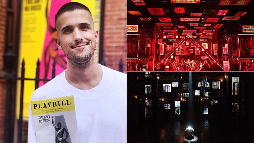
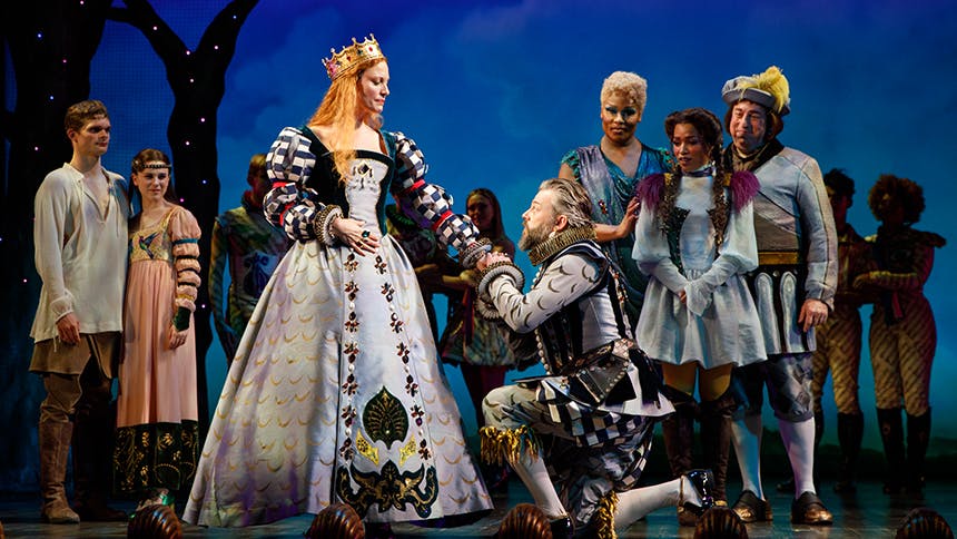
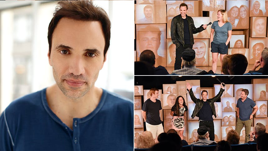
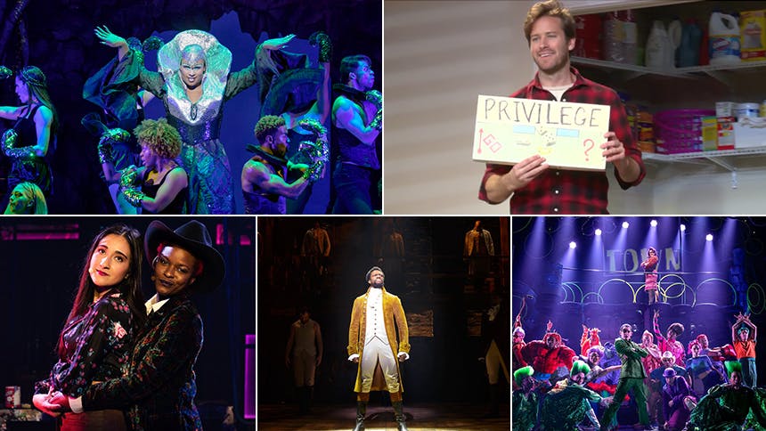
For his latest project, Jason Sherwood (the wunderkind who received Drama Desk & Lortel Award nominations for his incredible designs in the off-Broadway musical The View UpStairs and designed the current tour for Grammy winner Sam Smith) transforms off-Broadway's Atlantic Theater into one of New York's most iconic nightclubs Studio 54 for the killer new musical This Ain't No Disco
. BroadwayBox caught up with Jason to discuss his process of bringing 54 to the stage, silly set Easter eggs, and the confrontational, fleeting nature of the design. You’re tasked with bringing this iconic New York City place to stage, where do you begin?
I think some people had expectations that the show would be entirely set in Studio 54, or that we would stage it immersively inside of Studio 54. But, having done a lot of immersive or environmental work myself, you get used to those spaces very easily, but 54 is supposed to be a thing you get for a second, and then it’s gone. We only go three times in the show for three separate theme nights, and the final one is the final night of 54 before it closed. A lot of the photos that you see of 54 are sort of over exposed, and they seem kind of blurry, and there’s a haziness to them. We wanted to get that feeling more than I wanted to recreate the ground plan of 54.
Essentially, when you sit down to watch the play a lot of it takes place in places that aren’t Studio 54. When I was first thinking about it, I kept drawing these different iterations of what 54 could be on stage. We knew that we sort of had to lean into some sense of abstraction. The thing that we ultimately came to was that you couldn’t begin the show with something that felt glamorous at all, or that felt like 54 at all, or felt like the Mudd Club, or felt like the space that we call Warehouse (which is sort of a riff on Warhol’s Factory). Those places were so special because they emerged out of nowhere. For the same reason I love live theater, in the sense that it’s a femoral. It’s the same reason why I love nightlife, and why I was so excited to be a part of this, because you have to create something that is essentially only the way it is for one night. Even if the show runs for a year, every single night it’s like subtle alchemies are a little bit different, and the same with a dance party. You could go to the most incredible dance party of your life at Studio 54 on a given night, and go back the very next night, and the venue is the same, and the DJ could be the same, but the crowd is a little bit different, and weather is different, and something has changed, and it could be more fun or less fun, and you can’t necessarily predict that. I think that’s true of live theater as well. You could go see the same cast, do the same show three times in a row, and it would be different every time. So, I wanted to create something that had that spontaneity. There was this sense that we wanted to create a visual cacophony that would represent New York, that could feel very stark, and then out of what you were looking at, 54 could emerge.
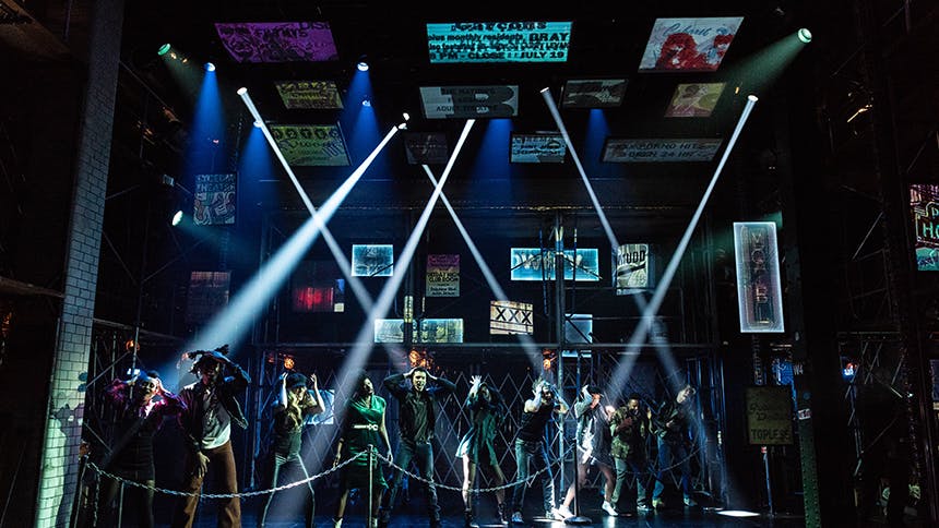
So we had to create something that felt like a shell of New York City the late ‘70s into the early ‘80s which is, in our case, this structure of scaffolding that seems to sort of hold up the walls of the theater, and then signs that sort of displays through it and extend beyond what the stage is, and over the audiences head. If you look at images from that time, particularly old Times Square, you see all these porno signs, and these smoke shop signs; then when you go downtown, there are no chains at all. So, it’s essentially individuality in signage, which is representation, and that’s a subtle aspect of our show—how you identify, who you are, and how you represent yourself.
What are the actual representations of Studio 54 that you included in the design?
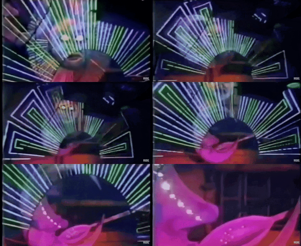
There were these light towers that are iconic at Studio 54. They were vertical, and they would fly, and lower down into the dance floor, and they had these sirens on the bottom of them. The original light towers were designed by [nine-time Tony Award winner] Jules Fisher. There’s this hilarious memo in Ian Schrager’s Studio 54 book, (Ian being one of the two co-founders of Studio 54) where he gets a letter from Jules, on Jules’ letterhead that says, ‘Ian, it has come to my attention that people are grabbing on to the light towers and holding on to them as they fly out. They’re not rated for this, you can’t do this! You have to tell people they can’t do that. They’re going to break, and someone is going to die or someone is going to get hurt.’ Then immediately next to it in the coffee table book is a picture of Ian himself hanging onto one of the light towers.
So, the light towers moved up and down, but you can’t really move anything up and down at the Atlantic because of the way the space is configured. So I was drawing them coming in at angles and pivot into the space. Then Darco [Tresnjak, the director] and I were sitting at his house up in Hartford, and he was like, 'God, it kind of looks like a pyramid.’ Then he went and Googled something, and it turns out the King Tut exhibit that was touring the United States and at the time came through New York the very year when our play was set. Then since Studio 54 was famous for its theme nights, we decided to invent a Studio 54 themed King Tut night that’s featured during the show.
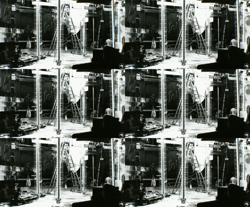
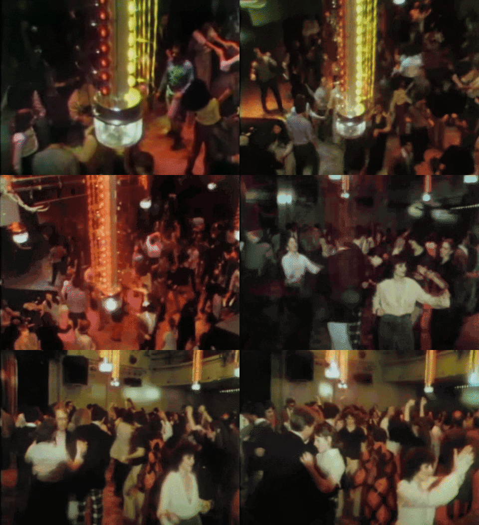
Then that pyramid of light towers could make a smaller dance floor with not that many people seem much fuller. That space itself could have inside and outside space. The artist and this publicist character, Binky, covet people from above, and select who they’re going to make their next star. So the inside, outside space became important to us too.
What was interesting as well was that we don’t go to the dance floor at Studio 54 proper for like 20-something minutes of the show. You actually spend a bunch of time downstairs—you go go the coat check, you meet a bunch of characters, and then there’s this like, wonderful ceremonial moment where Theo Stockman, who plays Steve Rubell kind of dons his pharaoh headdress, and sort of invites everyone to coronation, basically. Then the entrance that [54] makes is, hopefully, surprising, and different than it was expected to be.
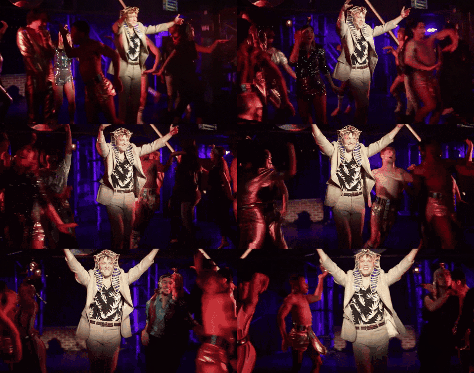
Another famous kind of Studio 54 iconography was the man on the moon in the coke spoon, which is this cut out shape of a moon that has a coke spoon coming off its nose. So, we knew the man in the man and the coke spoon had to be in the show.
What was the biggest design challenge for the set?
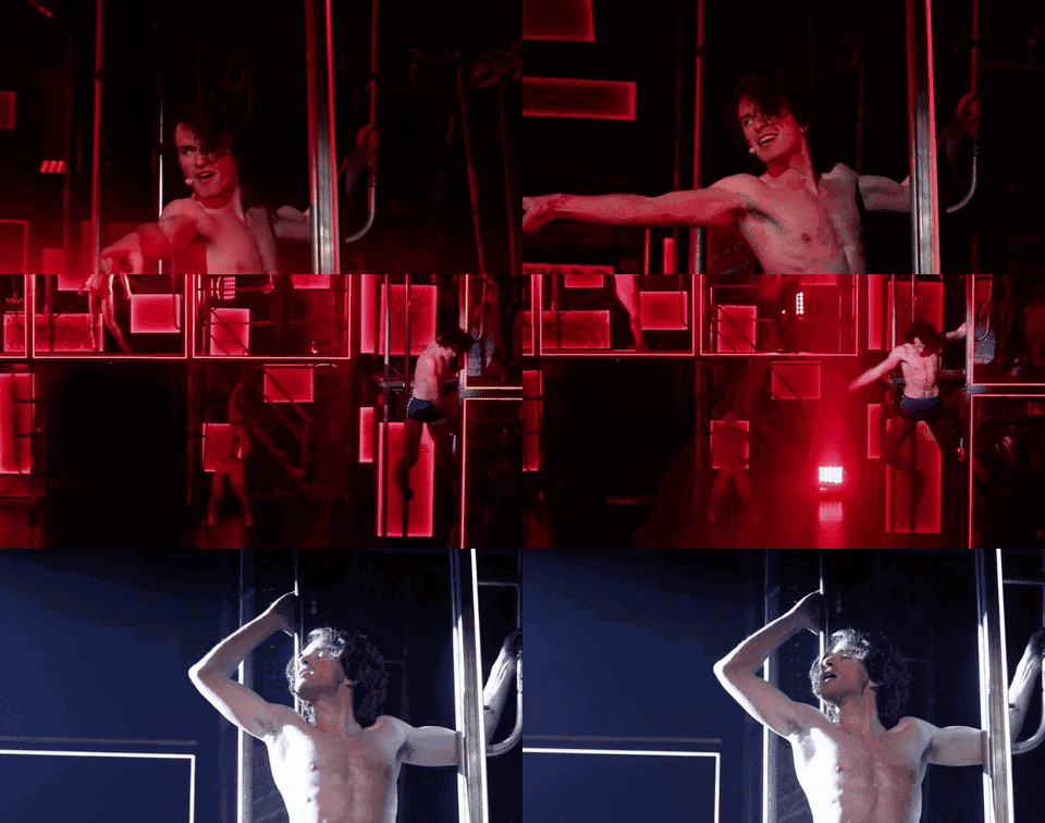
The show goes to like 891,000 places, and very, very quickly, and so each of them had to be sort of deluded down to an essential element, but not in a way that it felt like were serving up the same picture again, and again, and again. The show is ultimately about how we create homes or families for ourselves out of the raw materials at hand. So, there had to be this sense that we could create all of those places in a way that was very distinctly drawn, but not rely on the pressure of scenery to. We developed a concept that, essentially, every surface of the place is somehow treated with light in a way that is transformative, or treated with video in a way that’s transformative. I’m talking the floor, the ceiling, and the sidewalls. We have lights everywhere, we project everywhere, we put bodies on all three stories of the set, and the band is installed in the set at all times.
What art and media did you consume to get yourself in the space of 1970s New York?
If I had a dream board, this project was on it. I’ve always loved nightlife, and I’m obsessed with disco music. I go to disco parties in New York and Berlin. So this was a gift from the universe, but I came to the show with a lot of my own ideas about what nigh life, and dancing, and live theater meant as far as acts of community making. I think that live theater is an act of empathy making, and I think that nightlife or music are acts of community making. I think that coming into the show I knew I wanted to create something where the story could have a very direct in your face relationship to the audience. But I read a lot about 54 just to make sure that the parts we weren’t going to include, or the parts we were going to include, would at least be in and of themselves, authentic. Ian Schrager’s book is incredible, there’s an incredible book about the Mudd Club, and then honestly, my friend Andrew Holder has a disco playlist called The Only Disco Playlist You’ll Ever Need, and I just listened to that for three weeks straight. Then Darco and I looked at some images of sculpture from the time, and graffiti art from the time, and a couple of historical images of what New York felt like at that period.
How did you guys decide how to work the disco ball into a musical titled This Ain’t No Disco?
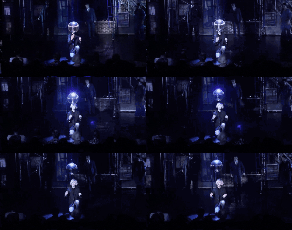
We went back and forth about whether or not to include a disco ball at all, and then we started with the idea that the disco ball is actually on the floor. There’s no curtain in the show, and when you come in there’s this lonely disco ball sitting on the floor in this kind of ugly environment. Then the character who plays the artist (who is sort of like a combination of Warhol and a bunch of people) comes in and starts the song. The dance floor is waiting, and he raises that disco ball, and there’s something ceremonial about that.
Tell me a bit about the piece that Theo rides on in our first glimpse of 54. What was the inspiration behind that?
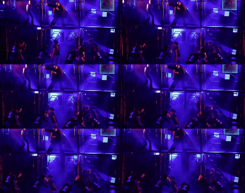
The entire upstage center part of scaffolding comes all the way to the edge of the stage, and it looks like it’s going to fall in the audience. This becomes the marquee and the entrance point, and there’s the 54 sign and there are the glass 54 doors. Everyone who is dying to get in is essentially being pushed into the laps of the front row, and then they’re in the audience like the rest of us begging to be let in. It happens within the first 10 minutes of the show, and what’s fun about it is it’s like we’re coming at you. It’s not interactive or immersive but I think the show is very confrontational. It doesn’t let you sit back. It comes right at you, which is nice. We’re not in a proscenium room, so we can do that really easily.
If you’re seeing Ain’t No Disco for the first time, there’s so much to take in. What are two or three cool set things that a first timer might miss if they’re not looking for it.
There are very few realistic or naturalistic New York elements to the show. There are these two subway columns: One is Chamber Street, and another one is West 4th. I always include some silly Easter egg, just for myself, and West 4th was my first subway stop when I lived in New York as an NYU student. This is so stupid, but my favorite thing on this set is on that column. There’s like a bit of dressing by our props person, the incredible Joshua Yocum. I asked him to do a few sticker things, and showed him some research. I showed him this one that had a wet paint sign, and he went over it with black Sharpie to write wet taint, and it’s become the thing everyone takes a picture with it.
Another is we wanted to create an illusion to Warhol’s Factory, and we focused in on these crushed foil walls. So, when we go to that scene, this huge foil drop rolls out of the top of the set where it’s been completely hidden, but it’s golden instead of silver. It was all very silver metallic in real life at that space, and we just sort of wanted to riff on it a little to be like, yes it’s this but not exactly.

Don't miss seeing Jason Sherwood's designs IRL in This Ain't No Disco at off-Broadway's Atlantic Theater Company through August 12.
