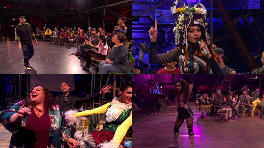
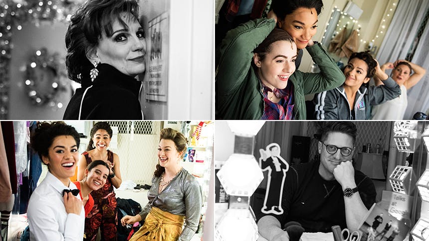
After a Tony and Pulitzer Prize-winning Broadway run and a film adaptation, the musical Rent conquered another medium when the television adaptation aired on Fox in January 27. If you watched the TV event, you were most definitely dazzled by Jason Sherwood’s production design. BroadwayBox caught up with the young designer behind off-Broadway’s The View UpStairs and This Ain’t No Disco, as well as the Sam Smith world tour, to learn about five secrets of the Rent set.
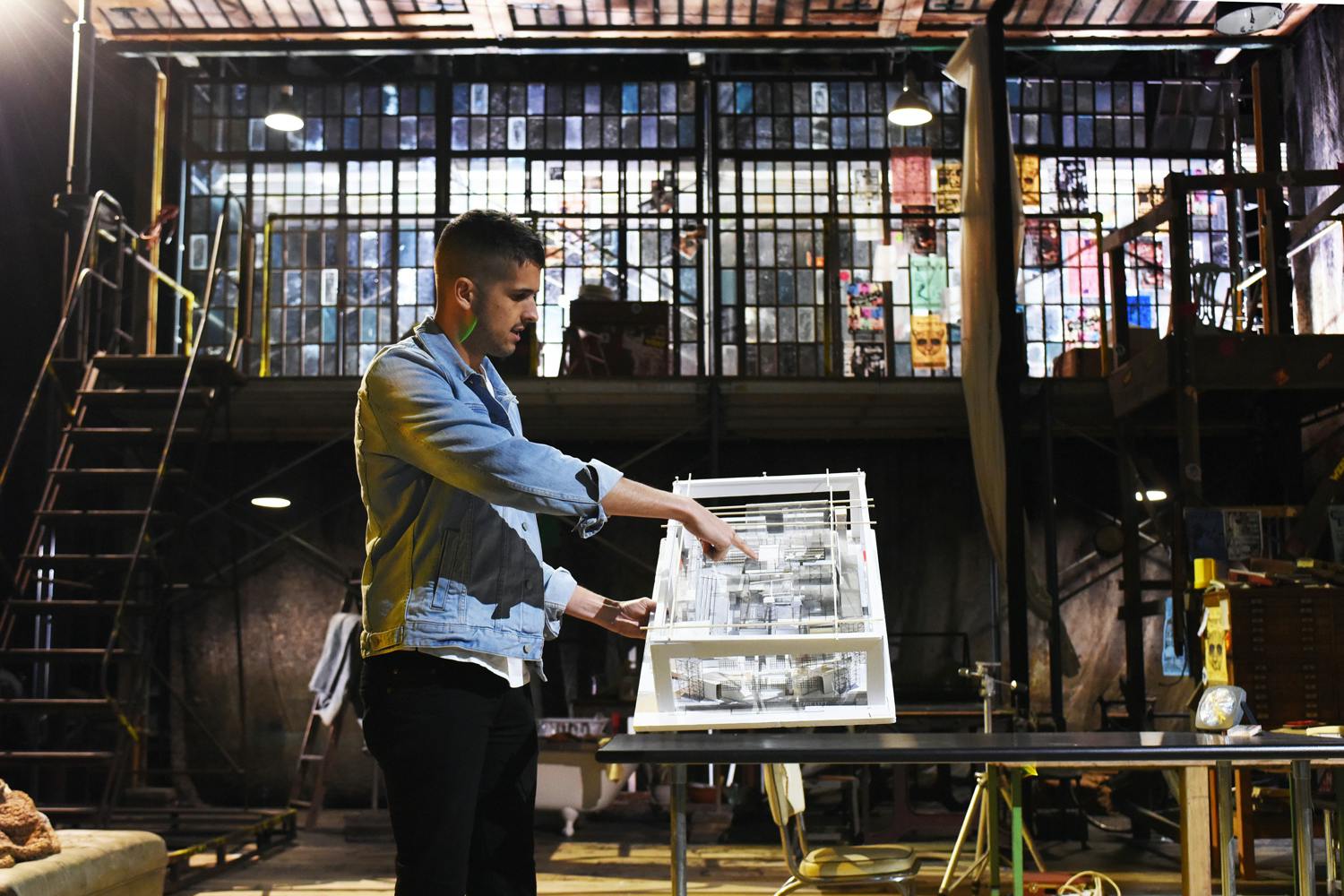
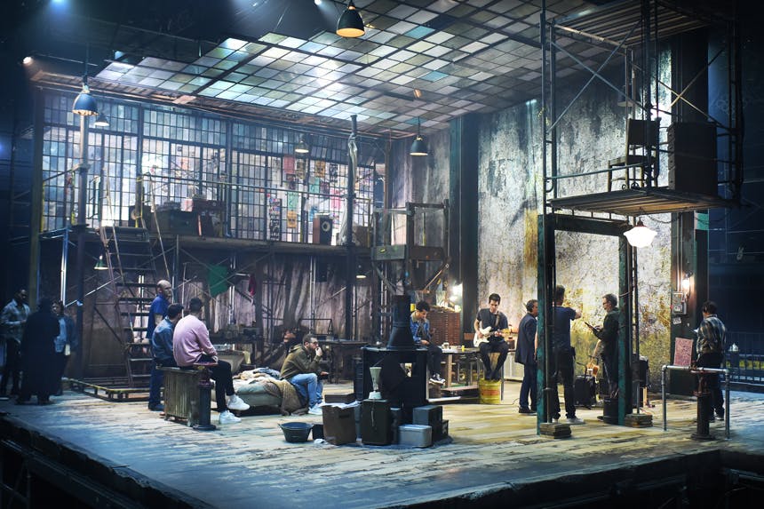
All About the Audience
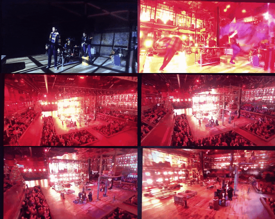
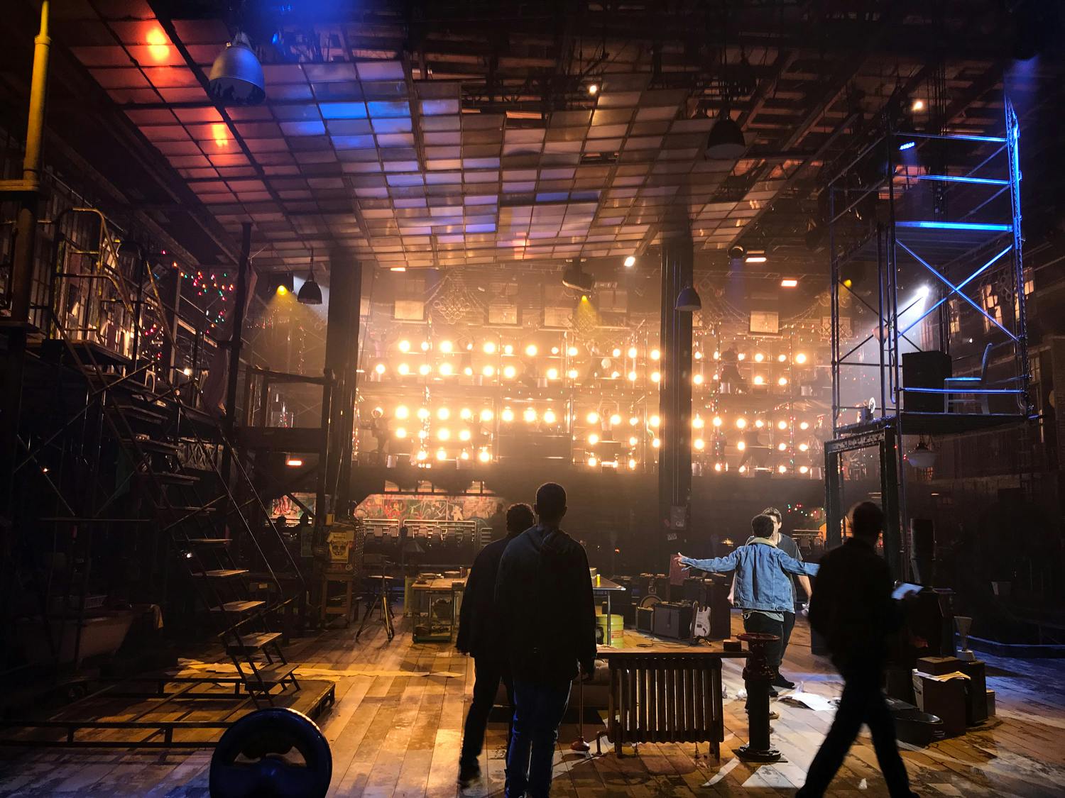
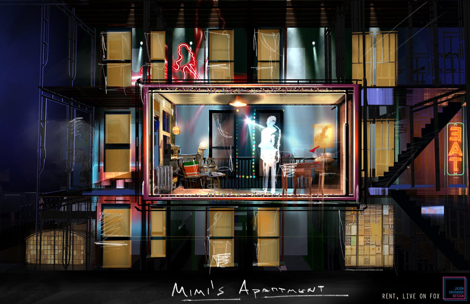
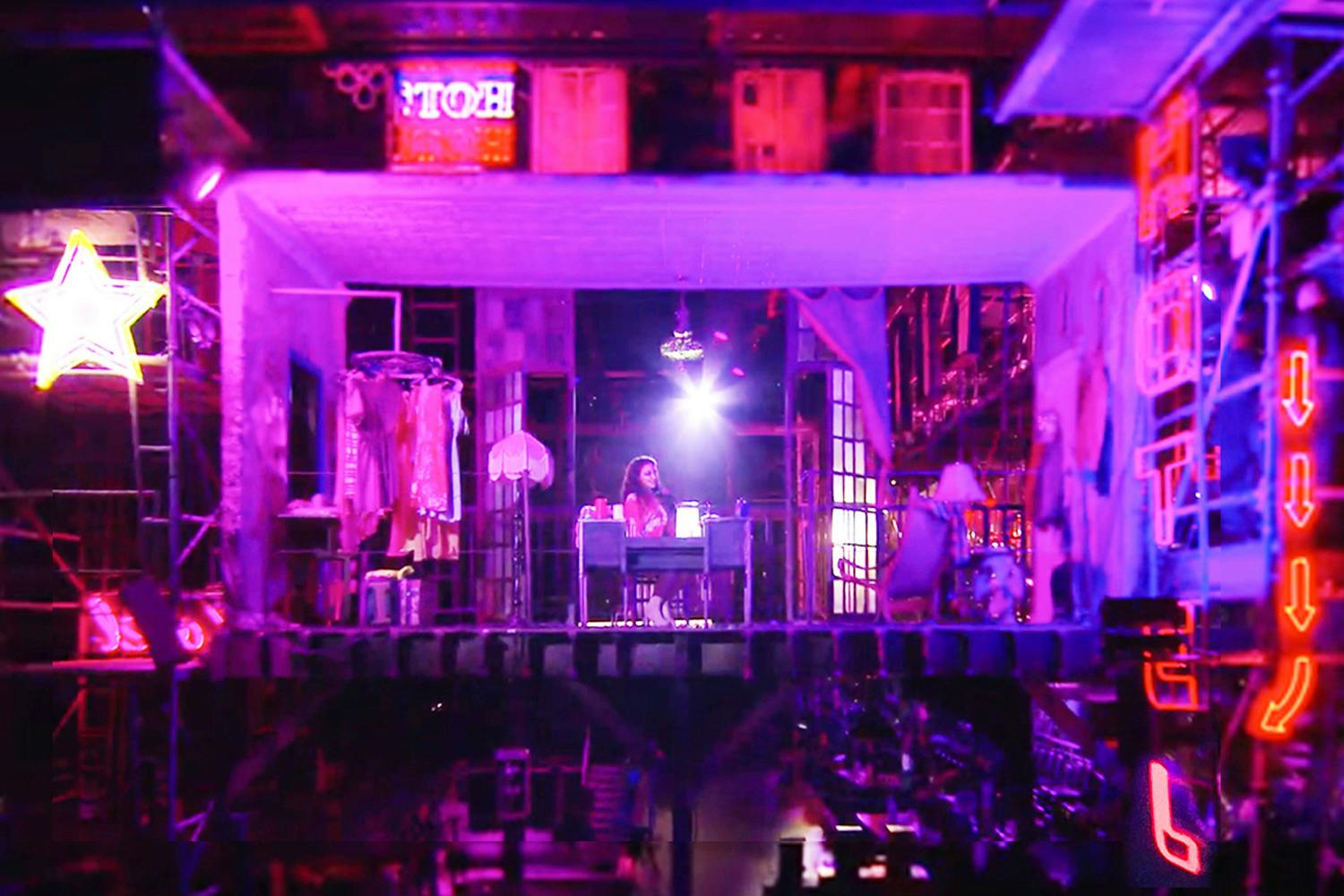
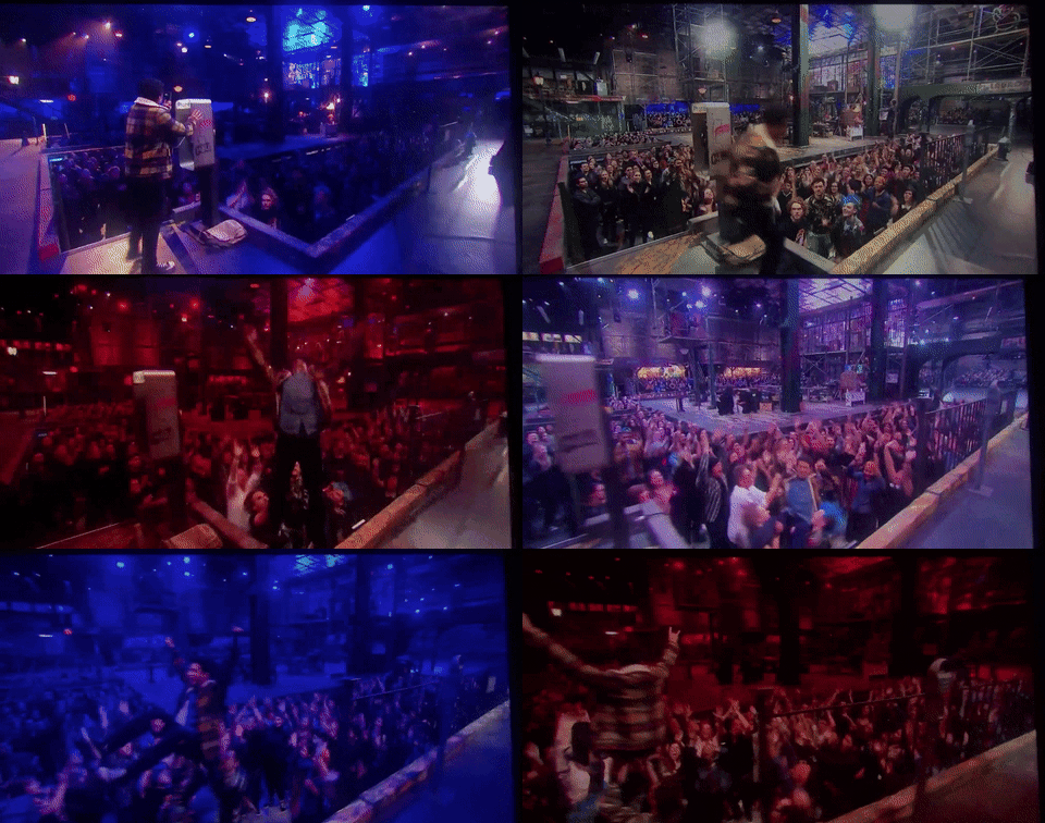
We really wanted to make it seem for the first 90 seconds or so that we weren’t going to have the live audience—we wanted it to feel like a three-wall sitcom or like some of the live musicals of the past have been. We wanted that moment when the music rocks out after “the power blows” to be a huge moment of reveal. So, I built the walls of the loft to essentially be large pieces of fabric that were stretched so it looked very solid on camera. Then when they were snatched away, they actually fell down into the space and were yanked back up into this machine called the sniffer, and then we would reveal the whole scale of the audience. That was something we were excited about from the beginning.
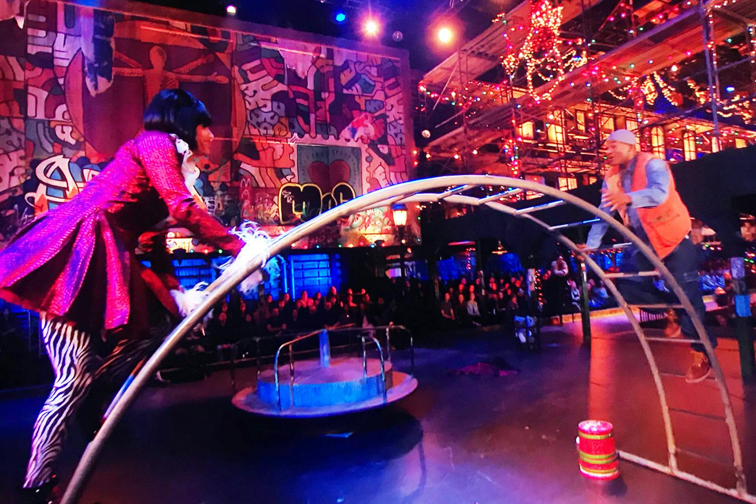
One thing that I loved about the show is that the intention was that in every shot there would be an actor, a sense of the physical environment they are in, and the audience. The audience would always be present—so it would feel like the taping of a rock show or Taylor Swift concert. That was the entire purpose of the show as far as the design—that it would always incorporate the people in the room.
Jonathan Larson Easter Eggs
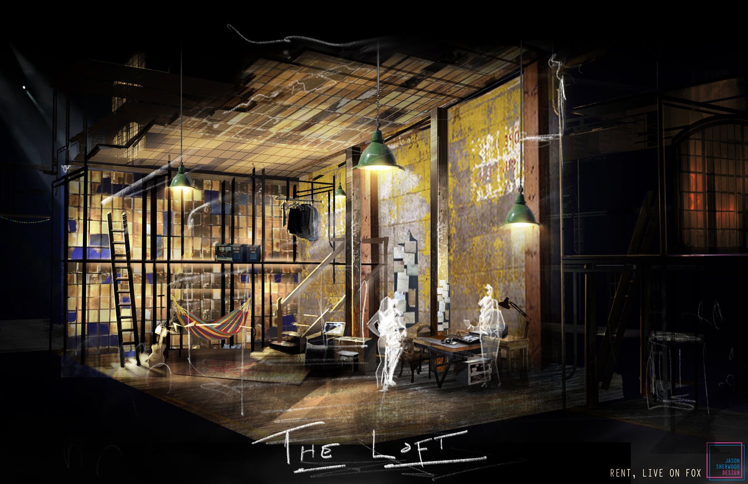
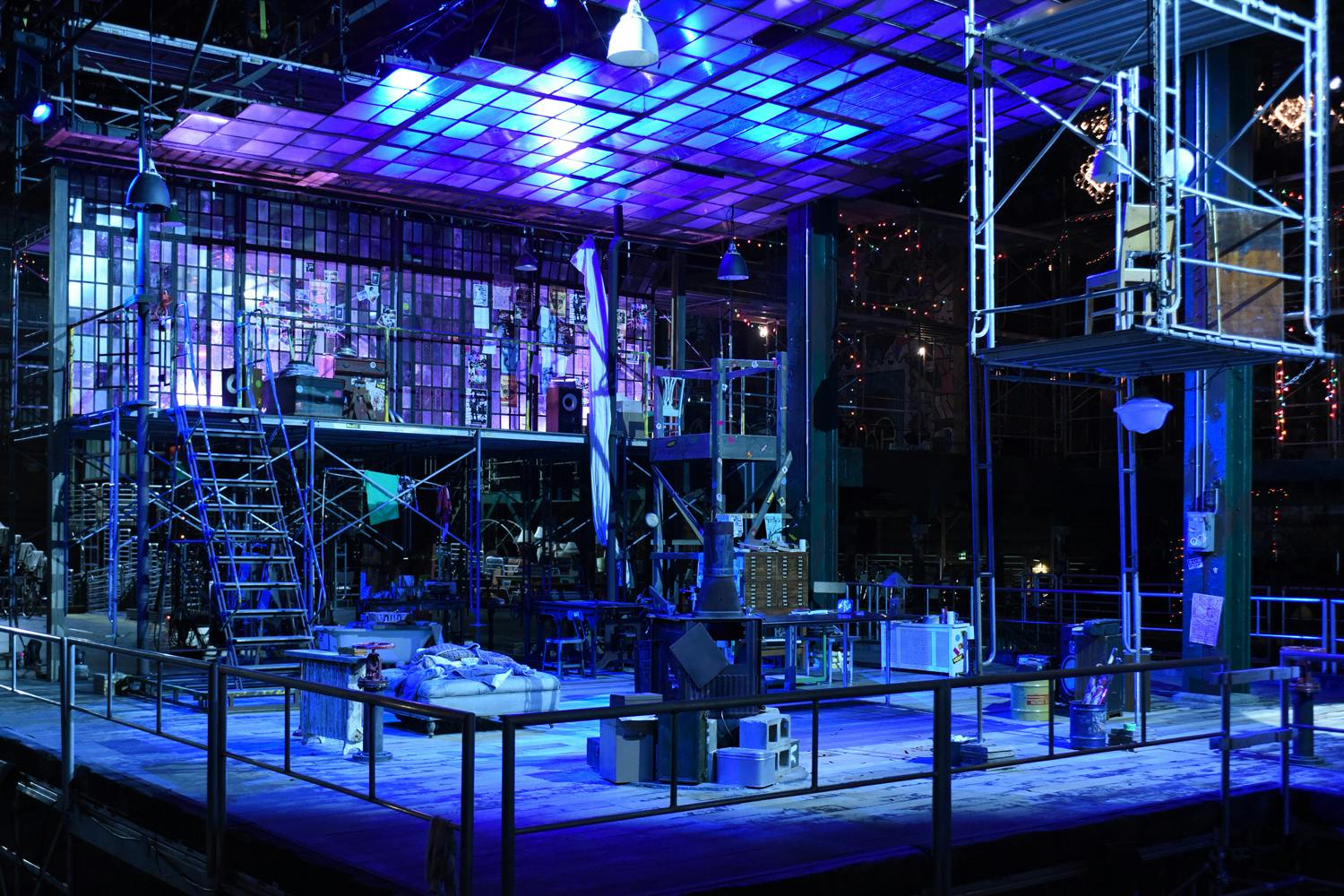
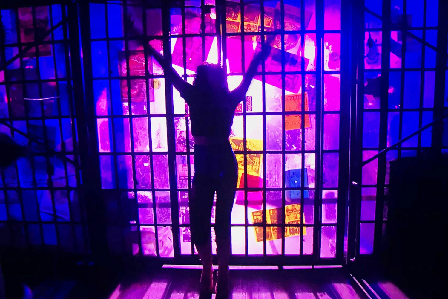
We wanted to get a lot of Jonathan Larson into the room to honor him and the energy of his presence, so there are a bunch of Jonathan Easter eggs throughout the room. There’s a Superbia poster directly behind Mark during “Seasons of Love”. By the payphone we did “We’re Okay” and “Halloween” at, there’s a poster for the Moondance Diner, where Jonathan worked for many years in New York City. Then there was a piece of jewelry of Jonathan’s that his family gave to us to include in the show that hung in the loft as well. Finally, the bathtub in the loft is obviously a nod to “No More” from tick…tick…BOOM. It was really incredible having Jonathan’s friends and family visiting, and there were pictures of his actual friends (who many of the characters were based on) all around the backstage area. It was very special.
Spotlight on the AIDS Crisis
We really wanted to tell the story of the AIDS crisis in a very succinct way. That is why there were some narration moments and some new dialogue for Mark. A lot of the people watching at home—especially the young people—don’t know the story of the AIDS crisis. We did a lot of work to include the Keith Haring “Silence = Death” poster that you see at the beginning of the “Life Support” scene and someone even wears a Silence = Death t-shirt during that scene. There is some Broadway Cares imagery on one of the boards, since they had been founded in just the years before our story is set, and they were kind enough to let us include them. The character that is typically Paul in the musical (the moderator of the life support meeting) was changed to Cy (played by Keala Settle). Cy was the name of the actual life support leader in Jonathan’s life that all of his friends were attending.
A Romantic Nod to West Side Story
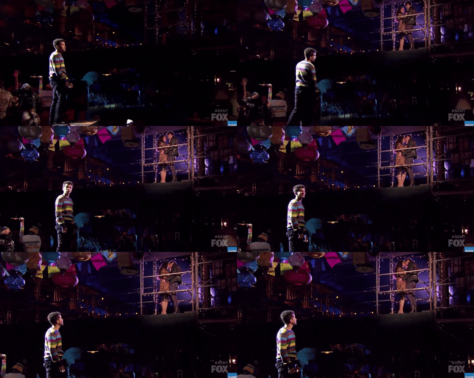
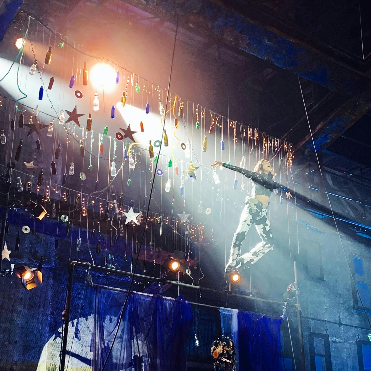
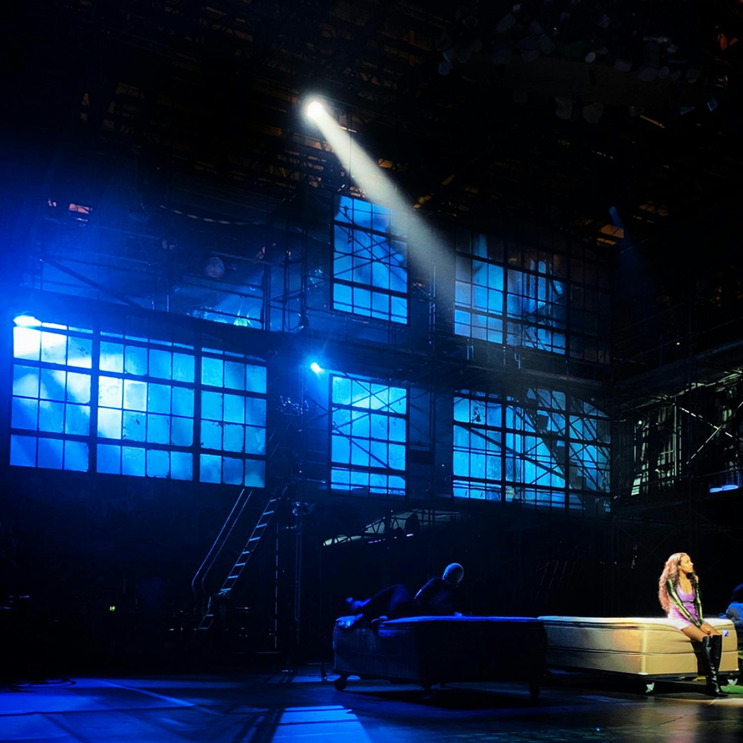
Another moment that’s near and dear to me that I love is “I Should Tell You”. It was an idea I came into the project with that Mimi and Roger would lift out of the environment they are in. I wanted a “Dance at the Gym”/the world falls away moment for them in this sea of bulbs and an abstraction of the moon would glow behind them. I wanted that song in particular to be vulnerable and intimate and romantic. There are so many moments in the show where people are singing and you see audience faces, but this was a moment we wanted to protect and make it feel like these two people are alone in the universe. The way that Alex Rudzinski shot that was beautiful and effortless.
A 360 Degree Experience
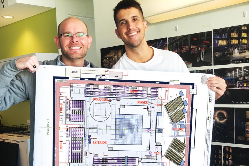
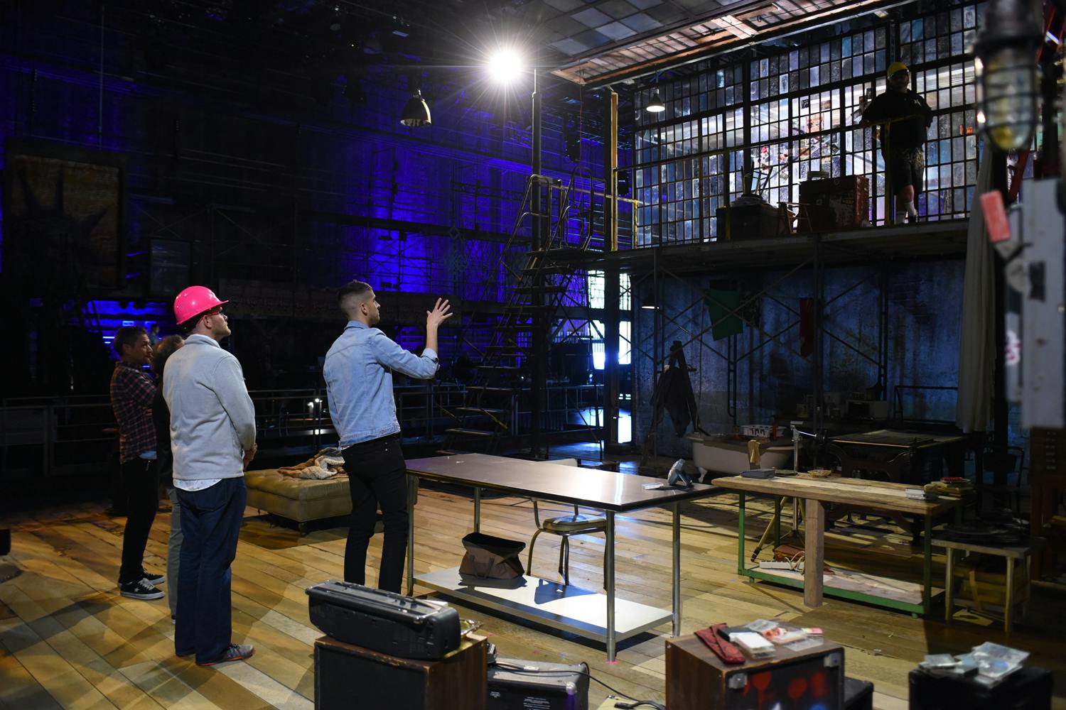
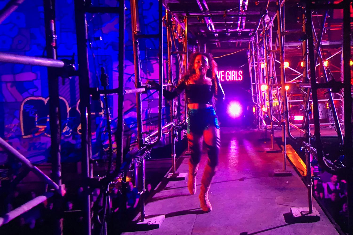
The biggest challenge was figuring out how to stage the show, light the show, and shoot the show without everyone stepping on each other. Rarely do you see camera on camera, which is incredible because the show was shot in 360. There are moments camera people are ducking behind a mailbox as to not be seen. It’s a very complicated dance and Alex Rudzinski and the whole team pulled that off really impressively. There hasn’t been alive musical like it, as far as how immersive the space was and what it demanded of everyone to pull it off.
“Will I” is my favorite part of the whole show. We had just done three intense numbers back to back, and then it’s just one steady cam operator and a guy walking around holding a light walking with Mark (Jordan Fisher) around the whole length space. The cast is preset singing this song and it’s an uninterrupted, continuous take with other camera men hiding not to get in the shot. Then we ask the audience to participate by holding up these candles. It was a recipe for disaster, but they pulled it off so beautifully. It was that kind of moment our concept or approach to the show was built on—the idea that these characters are living in 1991 and different than they would be in 2019, but the story is the same. There was something about creating a community in that room.
Bonus Personal Easter Eggs
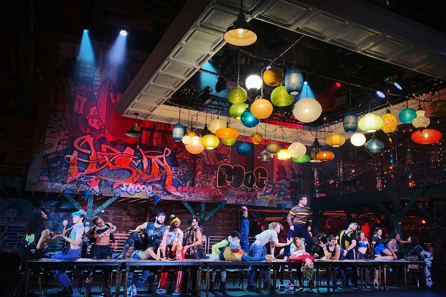
Two personal Easter eggs I’m really tickled by: over Roger’s right shoulder during “What You Own”, there’s the name Marie in bleeding red graffiti and that’s my grandmother’s name, and on the pay phone it says “for a good time call Cindy”, and that’s my mother’s name.
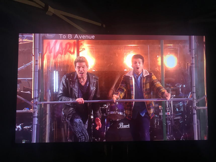
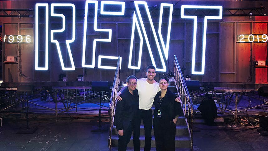
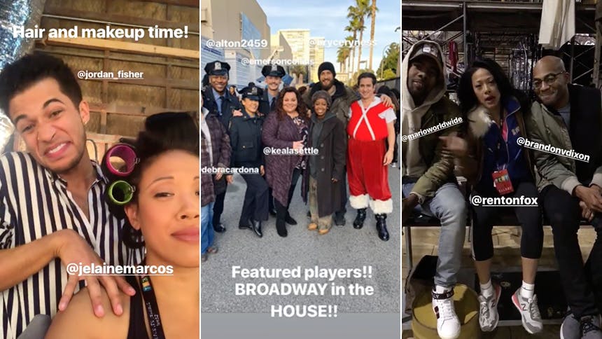
Some Additional BTS Set Photos
